Government Website Redesign
UX/UI Certificate
University of California, Berkeley Extension
February 2023
Project Vision
Many users have difficulty navigating their local count/city websites when they are setting up their utilities for the first time.
I am aiming to make this journey for users easier and more straightforward.
Currently on the West Linn City website, it is hard to navigate to the correct page to set up utilities.
Goal: to make the navigation more clear and easier for the users to navigate to the appropriate page.
Role: UX Designer, Researcher
Tools: Figma
Length: 2 Weeks
The Process
This project started with Research and finished with Prototyping and Testing.
Heuristic Evaluations Overview
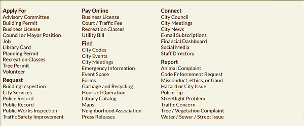
Home Page
-
Too much content
-
No directions for new homeowners
-
overwhelming to look at
-
no account or customization
Finance Page
-
Lots of text
-
Need to search for next step
-
overwhelming to look at
Moving? Starting Service?
-
Lots of text
-
For link is in a paragraph
Form
Page
-
No way to clear the form
Heuristic Evaluations Findings
Error Prevention
-
No guidelines for the user to follow
-
some of the links can be missed because of content
-
A lot of text on the website, very overwhelming
-
transitions from website to mobile is not formatted correctly
Aesthetic and Minimalist
-
Some of the provided documentation send the user in circles
-
prompts the user to call listed phone number
Help and Documentation
Heuristic Evaluations Insights
Having too much text on the webpage can overwhelm the user and distract them from accomplishing their goals. It will also cause frustration as the user is not able to find where they are supposed to go.
Adding a section in the "How Do I.." for new homeowners will help the user find what they need.
I learned that... there can be multiple ways to reach an objective, however having too many different ways will confuse the user.
Prototype, Test and Iteration
Create a section in the navigation bar that is specific to new homeoweners or a section in the "How Do I..." to set up utilities. This will address two user pain points by minimizing the number of options and being directed to the correct page without feeling overwhelmed by the amount of pages and running in circles.
Add:
Set Up Utilities
Pay Utilities

.png)

.png)
Low-Fidelity Wireframing and Prototype
Desktop
Mobile


Design Theories Present in Mid-Fidelity
Proximity
Used to group together components, such as the side menu and the main section bubbles on the home screen.
Figure/Ground
Used in the Image Sliders in both the desktop and mobile versions. The user's brain is able to distinguish whether or not the item is in the foreground or the background.
Similarity
Used in areas, such as the calendar, to let the user infer that the components will have a similar effect to each other when the user interacts with them.
Symmetry & Order
Used in the Image Sliders in both the desktop and mobile versions. The user's brain will automatically fill in the whole image, even as it is behind other images. This is because the brain already knows the shape of the item. The user knows what kind of item is behind the front item.
Mid-Fidelity Wireframing and Prototype
Desktop
Mobile
A/B Testing and Results
Image A

Image B

The testing that was performed was a Preference Test.
The tester was asked to pick which design they preferred for a mobile application.
The items shown are for non-menu items for navigation in the body of the mobile webpage.
Results and Feedback

Results
-
13 testers provided feedback
-
12/13 testers preferred image A over image B
Feedback from Testers
-
"Easier to work"
-
"I don't like the blank space in the other one"
-
"I think it has a cleaner more 'professional' look and it is clear that the + indicates further detail or options within"
-
"I like that they are all in line and there is a clear drop down menu"
-
"I am used to this format"